 The Warming ‘Hole’ Myth: Non-Warming Regions Are More Rule Than Exception
Earlier this month, the authors of a new paper (Partridge et al., 2018) published in Geophysical Research Letters promulgated the term “warming hole” to describe the cooling temperatures gripping most of the Eastern half of the United States from the late 1950s through 2015.
“We present a novel approach to characterize the spatiotemporal evolution of regional cooling across the eastern U.S. (commonly called the U.S. warming hole), by defining a spatially explicit boundary around the region of most persistent cooling.
The warming hole emerges after a regime shift in 1958 where annual maximum (Tmax) and minimum (Tmin) temperatures decreased by 0.46°C and 0.83°C respectively. … [T]he seasonal modes also vary in causation. Winter temperatures in the warming hole are significantly correlated with the Meridional Circulation Index (MCI), North Atlantic Oscillation (NAO), and Pacific Decadal Oscillation (PDO). … We select only stations in the contiguous U.S. that have an 80% complete record from 1901-2015, resulting in 1407 temperature stations.”

Of course, by characterizing it as merely a “hole” in the global-scale warming over this period, this cooling has been portrayed as highly anomalous, an isolated exception to the trends that have encompassed the rest of the Earth.

But is this particular Eastern U.S. cooling trend truly an exception for this period? From all appearances, no. Large regions of the Earth have also cooled, or at least not warmed, in the last several decades.
Even a closer inspection of this “warming hole” paper (Partridge et al., 2018) reveals that not only did 124 temperature stations from the Eastern U.S. “warming hole” region show a cooling trend since the 1950s, but another 1,283 stations from the rest of the continental U.S. (mostly the Western half) also did not collectively show a clear warming trend throughout the entire 115-year period.
In other words, 1,407 temperature stations from across the contiguous U.S. do not show any warming trend during 1901 to 2015.

About One-Third Of The Northern Hemisphere Cooled During 1990-2015
According to the IPCC, modern warming has a “global signature“, whereas past warming and cooling events such as the Medieval Climate Anomaly and Little Ice Age were not “globally synchronous”.
But if modern warming truly is both global and synchronous, why are large regions of the Earth experiencing cooling — or at least non-warming — trends in recent decades?
In the Northern Hemisphere, for example, scientists (Kretschmer et al., 2018) have identified other “warming holes” in the temperature data for the 1990-2015 period. About 80% of the contiguous U.S., Europe and much of Asia, including parts of the Arctic (Eastern Siberia), cooled during the 1990-2015 period. These cooling regions may encompass approximately one-third of the top half of the globe.
“Despite global warming, recent winters in the Northeastern United States (US), Europe and especially in Asia were anomalously cold. Some mid-latitude regions like Central Asia and eastern Siberia even show a downward temperature trend in winter over the past decades (Cohen et al. 2014a; McCusker et al. 2016).”


In some regions that were depicted as warming overall during 1990-2015 in the graph above, there has been a cooling trend since the mid-2000s.

Image Source: Smeed et al., 2018

Image Source: Cheung, 2017

Image Source: Yan et al., 2015
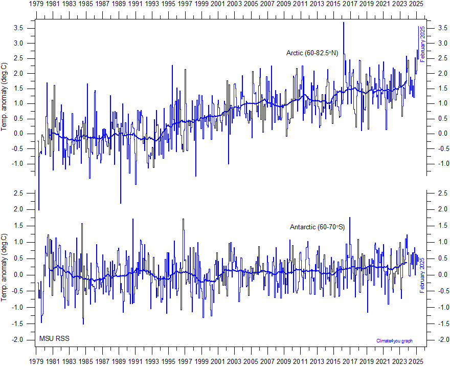
Much Of The Southern Hemisphere Has Been Cooling Since 1979
In the Southern Hemisphere, Antarctica has not warmed in the last 38 years.

Image Source: Climate4You
The Southern Ocean surrounding Antarctica and extending into the South Pacific has been cooling since 1979 (Purich et al., 2018).
“Observed Southern Ocean changes over recent decades include a surface freshening (Durack and Wijffels 2010; Durack et al. 2012; de Lavergne et al. 2014), surface cooling (Fan et al. 2014; Marshall et al. 2014; Armour et al. 2016; Purich et al. 2016a) and circumpolar increase in Antarctic sea ice (Cavalieri and Parkinson 2008; Comiso and Nishio 2008; Parkinson and Cavalieri 2012). … The majority of CMIP5 models do not simulate a surface cooling and increase in sea ice, as seen in observations.”

So Why Do The Global Temperature Graphs Show Such Strong Warming In Recent Decades?
Global temperature graphs are made to look like they are burning hot all across the globe.

But the “data” that adds varying shades of red coloration to graphs of global temperature are largely just in-filled by computer models. That’s a nice way of saying they’re mostly concocted, as there is no actual temperature data available in the regions of the globe (gray) where much of the Earth is allegedly sweltering.

Image(s) Source: RealClimateScience.com
Southern Hemisphere Sea Surface Temperatures ‘Mostly Made Up’
Dr. Phil Jones, the overseer of the Climate Research Unit temperature data, even admitted in an intercepted e-mail that the sea surface temperature data in the Southern Hemisphere temperature record are “mostly made up”.

The Leaked Hide the Decline Conversations With Dataset Overseers
“…you really ought to replace the values from 1961 onwards with observed [instrumental] temperatures due to the decline.”
“I’ve just completed Mike’s Nature trick of adding in the real temps to each series for the last 20 years (ie from 1981 onwards) and from 1961 for Keith’s to hide the decline.”
“Also we have applied a completely artificial adjustment to the data after 1960, so they look closer to observed temperatures than the tree-ring data actually were” …. “Also, we set all post-1960 values to missing in the MXD data set (due to decline), and the method will infill these, estimating them from the real temperatures – another way of ‘correcting’ for the decline, though maybe not defensible!”
Dataset Overseers ‘Hide The Decline’ In Temperatures By Changing Data
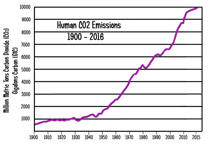
It is likely that the reason why today’s global temperature reconstructions show such strong warming in recent decades (and a rather unremarkable rise in the early 20th century) is that they have been heavily adjusted to match climate model expectations. The adjustments cool the past and warm the present to fit with the explosive linear trend in anthropogenic CO2 emissions.
For example, the combined Hadley Centre and Climatic Research Unit (HadCRUT) data set — which is featured in the Intergovernmental Panel on Climate Change (IPCC) reports — underwent a revision from version 3 to version 4 in March of 2012. This was about a year before the latest IPCC report was to be released (2013). At the time (early 2012), it was quite inconvenient to the paradigm that HadCRUT3 was highlighting a slight global cooling trend between 1998 and 2012, as shown in the graph below (using HadCRUT3 and HadCRUT4 raw data from WoodForTrees).
Graphs used by the IPCC depicting a slight cooling trend since 1998 would not be acceptable to policymakers wishing to emphasize the urgency of addressing dangerous global warming. So, just in time for the 2013 edition of the IPCC report, about 0.1°C was added to the 1998-2012 HadCRUT trend. The effect was to transform the slight cooling into what the IPCC called a “hiatus” from warming. To achieve the removal of the slight cooling trend found in HadCRUT3, the more recent anomalies in HadCRUT4 were warmed up (by 0.1 to 0.2°C), whereas the past warmth (especially around 1998) was left intact. The effect was to warm the present and cool the past.

Source: WoodForTrees
Artificially Removing 0.5°C From The 1880-1950 Warming
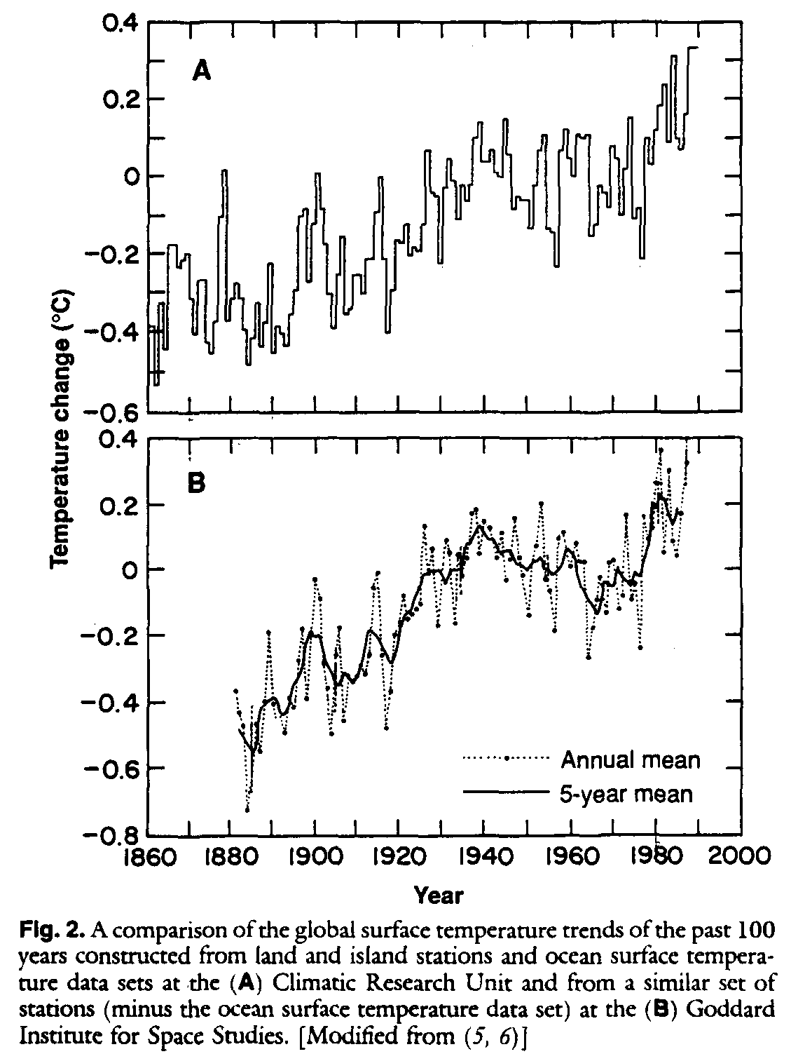
As recently as 1990, it was commonly accepted that there was pronounced warming of about 0.5°C between the data points 1880 and 1950.

Image Source: Pirazzoli, 1990
This 0.5°C rise in global temperatures between 1880-1950 (and 0.6°C between 1880 and 1940) can clearly be seen in the NASA GISS graph from 1987:

Schneider, S. H. 1989 The greenhouse effect: Science and policy. Science 243: 771-81.
By 2014, the 0.5°C of warming between the years 1880 and 1950 had been completely eliminated. There is now no trend between those two data points.

Image Source: NOAA (2014)
What Warming Hole?
The portrayal of a globally-synchronous warming of the Earth with only small pockets of “warming hole” anomalies is not supported by local and regional data reported in scientific papers.
There are not tiny, isolated holes of cooling in an otherwise uniformly-warming world. These are gaping expanses of cooling…or non-warming.
Yes, some regions of the globe have been warming. Some regions have been cooling. And some regions remain trendless.
But in recent decades, the warming has not been global in scope.
Read more at No Tricks Zone


Will we soon read that these “warming holes” are not anomalies? That they occur only where humans have adopted sustainable lifestyles?
Sure, why not? Pat themselves on the back.
All those Greens using Global Warming/Climate Change in their fake TV ads like EDF are making false and misleading ads the Watermelon groups like NRDC,EDF,GREENPEACE Etc are making false and misleading ads and especialy the EDF using kids in their fake ads