
Everyone has seen some version of the climate hockey stick by now.
A thousand years of nearly flat, gently cooling temperatures… then a vertical blade in the twentieth century. That picture is used to sell a straightforward story. [some emphasis, links added]

The past was stable and boring, the present is sharply different; therefore, recent warming must be almost entirely caused by human CO2 emissions, and we face an unprecedented crisis that justifies emergency policies, Net Zero deadlines, and trillions in spending.
You’ve also likely seen those trendy “warming stripes” graphics plastered everywhere… blue fading to red, screaming that our planet’s suddenly turned into a furnace thanks to human CO2.

But what if I told you those stripes, and that hockey stick, are built on a house of cards, a deliberate distortion that hides Earth’s wild, natural temperature swings?
Enter the smoking gun: Figure 5 from the 2020 study, “Prominent Role of Volcanism in Common Era Climate Variability and Human History“, published in Dendrochronologia.

This isn’t just another paper; it’s the visual takedown that proves the so-called “unprecedented” warming is anything but, and the entire climate crisis narrative collapses without the statistical sleight-of-hand that flattens our chaotic past.
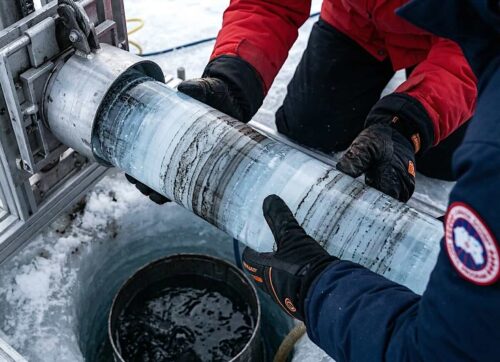
As a geochronologist and isotope geochemist with years decoding proxy records like tree rings and ice cores, I’ve long called out how variance manipulation, smoothing out short-term peaks through low-resolution sampling or selective averaging, erases historical extremes. See how these tricks warp reconstructions.
Without them, data from tree-ring width chronologies across the Northern Hemisphere reveals a rollercoaster of natural variability, driven by volcanoes, solar cycles, and more… not CO2 as the almighty knob.
CO2 is *not* the heat wave control knob pic.twitter.com/zDzMQodE6x
— Tom Nelson (@TomANelson) May 5, 2025
The study’s novel ensemble approach compiles every available Common Era-spanning tree-ring dataset, creating two key reconstructions: EA (Eurasian, covering 10°W to 180°E, extra-tropics >30°N) and EA+ (extended Eurasian/North Atlantic sector, 180°W to 180°E, same latitude).
These medians of regional ensembles, drawing from 6,767 and 9,492 series respectively, strip away the biases of single-proxy picks, delivering a raw, high-fidelity view of June-August temperatures from 1 to 2010 CE.
Now, zoom in on Figure 5 (above)… the bombshell. It displays “temperature stripes” for the EA, EA+, and PAGES 2k (a multi-proxy consortium effort) reconstructions, color-coded in 15 shades from deep blue (cold) to fiery red (warm), anomalies relative to 1961-1990.
Forget the sanitized, modern-[day] stripes peddled by alarmists; this figure exposes the lie head-on.
Dense clusters of red stripes dominate early centuries like the 280s CE (Roman Warm Period peak) and 990s-1020s CE (Medieval Warm Period highs), matching or exceeding mid-20th-century warmth… all under preindustrial CO2 levels around 280 ppm.
Blue bands swarm during volcanic-driven chills, like the 536-545 CE decade kicking off the Late Antique Little Ice Age (LALIA), with six of the 20 coldest summers crammed in there.
The “flat” pre-1900 line? Obliterated. Instead, you get synchronized, hemisphere-wide swings of 1-2°C, proving the hockey stick’s muted variability is a fabrication.
This isn’t subtle; it’s damning.
The EA/EA+ stripes pulse with premedieval low-frequency variability 33% stronger than PAGES 2k’s damped version, thanks to tree rings’ superior resolution capturing volcanic aerosols’ cooling punch (negative correlation of -0.56 to -0.58 with Stratospheric Aerosol Optical Depth).
Post-eruption summers drop ~0.4°C for a decade, explaining historical disruptions without a CO2 whisper. Unravel how natural forces beyond CO2 fueled enigmas like the Little Ice Age.
Without these statistical cons…the current warming looks utterly natural: a rebound from the Little Ice Age’s depths, fitting within millennia of volcanic-solar forcing.
Meanwhile, warm stripes align with low volcanism and solar maxima, echoing the Medieval Warm Period’s global footprint, from Chinese lake sediments to Antarctic glacial retreats, erased in IPCC reports to prop up the “unique” modern narrative.
Without these statistical cons… compressing variance via filters that kill cycles under 300 years or cherry-picking proxies to flatten peaks, the current warming looks utterly natural: a rebound from the Little Ice Age’s depths, fitting within millennia of volcanic-solar forcing.
No crisis, no trillion-dollar panic. Equilibrium sensitivity to CO2? Inflated nonsense when natural swings mask the signal.
This is the cornerstone fraud: the hockey stick, born from Mann’s 1999 PCA tricks and amplified in 2001 IPCC graphics, “buried” inconvenient warmth to manufacture urgency.
Figure 5 resurrects it, showing stripes that scream variability, not stability.
Irrational Fear is written by climatologist Dr. Matthew Wielicki and is reader-supported. Ready to ditch the fear factory for the unvarnished truth? Please subscribe and support the work that goes into it. Check the link below for any specials.
Read more at Irrational Fear


This article is a tree ring circus.
All climate proxies are inaccurate estimates of past average climates.
Margins of error are at least ±1° C.
In the 1990s, scientists believe the variations in the past 500 years were ±0.5° C. Below the likely margin of error and statistically insignificant.
There is zero evidence that any warming period in the past 5000 years equaled or exceeded the measured +0.7° warming in the past 50 years.
Not that, proxy estimates should ever be compared with measurements.
The warmest period in the past 10,000 years was likely the Holocene Climatic Optimum, which occurred roughly 9,500 to 5,500 years ago. This period, also known as the Mid-Holocene Warm Period, had a thermal maximum around 8,000 years ago. However, recent studies show that the current decade is warmer than 75% of the Holocene, and annual global temperatures are now warmer than at any point in the last 10,000 years, a departure from previous scientific understanding.
Correction:
Around 1990, some scientists believed temperature variations in the past 5000 years (not 500) were ±0.5 degrees C. Others believed ±1°C. Meaning warm periods were O.5° to 1.0 above average and cold periods were O.5° to 1.0 below average. Statistically insignificant when using tree ring proxies.
The smarmy IPCC published a 1990 chart with these data, but they stripped the C. numbers from the chart: The IPCC just showed a WAVY line on a chart.
Tree rings are proxies for temperature and rainfall.
In dry areas, ring width is often a strong indicator of precipitation, while in high-latitude or high-elevation locations, it more closely reflects temperature. This is not a precise scientific measurement of the global average temperature.
Using tree rings as a climate proxy can have several problems, including the divergence problem, where tree growth and actual temperature records disagree in recent decades, and the influence of non-climatic factors like insect damage or forest fires on ring width. Additionally, the data has limited geographic coverage and difficulty in capturing long-term climate trends.
The Mann tree ring circus cherry picked proxies were even worse than the original 1990 tree ring proxies. He cherry picked proxies to reduce variations to an unreasonable ±0.1 to ±0.2C. The IPCC loved his chart and published it in 2001.