Almost every claim about a looming climate crisis rests on a single foundational assumption. We are told that scientists have a precise and reliable understanding of global temperature. [some emphasis, links added]
We are told that we know what the planet’s temperature was in the past, that we know what it is today, and that the difference between those two numbers proves something unprecedented and dangerous is underway.
If that assumption is wrong, or even deeply uncertain, the entire structure built on top of it becomes unstable. Climate models lose their anchor. Policy prescriptions lose their urgency. Trillion-dollar decisions begin to look far less justified.
That is why the global temperature record matters so much, and why it deserves far more scrutiny than it receives.
This is not an argument against measuring temperature, but an argument for understanding how much judgment and interpretation are embedded in the number we are told to trust.
In recent years, that scrutiny has begun to expose uncomfortable cracks. Historic heatwaves quietly disappearing from national records. Extreme modern temperatures are recorded next to jet engines and asphalt. Adjustments that consistently cool the past while warming the present.
Individually, each issue is brushed off as technical or trivial. Taken together, they point to something far more serious.
Before getting into the details, it is worth asking a basic question:
What exactly is this metric that everything depends on?
The Metric Everything Depends On
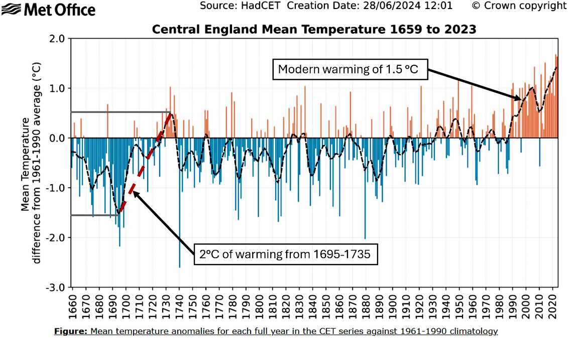
When I speak publicly about climate science, I often begin with the longest continuous instrumental temperature record on Earth, the Central England Temperature series.
It stretches back to the late seventeenth century and shows dramatic swings long before industrial emissions or modern energy use. There are periods where temperatures rose or fell more quickly than anything we observe today.
The response is always the same. England is only one region. Climate change is global, not local.
That response sounds reasonable, but it quietly shifts the discussion to a much weaker metric. Once we move away from individual observations and toward a single global average temperature, we leave the realm of direct measurement and enter the world of statistical construction.
That distinction is rarely made clear to the public.
What Global Temperature Actually Represents
The Earth does not have a single temperature.
It has deserts and rainforests, oceans and mountains, cities and ice sheets. Temperature varies enormously across space and time. There is no physical instrument that measures a global average.
To produce a global temperature number, scientists combine surface weather stations with ocean measurements from ships and buoys, then use statistical techniques to fill in the vast areas where no measurements exist.
This process relies heavily on assumptions about how temperature behaves across distance and time.
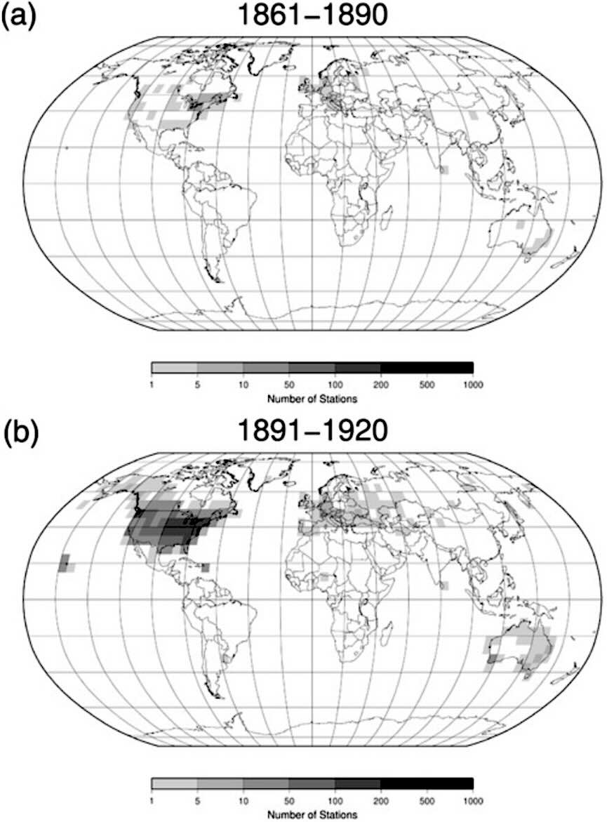
Much of the planet, especially the oceans and large portions of the Southern Hemisphere, had extremely sparse coverage well into the twentieth century.
Even today, the oceans dominate the global average, yet direct measurements there are limited and constantly changing in method.
Global average temperature is therefore not a simple observation. It is a constructed metric. A blend of measurements, estimates, and adjustments.
That does not automatically make it wrong. But it does make it fragile.
I laid this out in detail in my earlier work on why a single global number props up the climate crisis story and why global mean temperature is physically meaningless as a diagnostic metric.
What makes the situation far more troubling is what has happened to the data over time.
A Persistent Pattern in the Adjustments
When people hear that temperature records are adjusted, they are usually told not to worry. Adjustments are described as small, technical corrections meant to improve accuracy.
In isolation, that sounds reasonable. No measurement system is perfect, especially one that spans more than a century.
The problem is not that adjustments exist. The problem is the direction they overwhelmingly move.
When we examine official temperature datasets over time, a clear and consistent pattern emerges. Earlier temperatures tend to be revised downward, while more recent temperatures tend to be revised upward.

Each change may appear minor, sometimes just a few tenths of a degree, but over decades, the cumulative effect is significant. The past becomes cooler and less variable, while the present becomes warmer and more extreme.
This is not speculation. It is visible directly in the data.
I explored this pattern in detail in my work examining how the Intergovernmental Panel on Climate Change has treated past climate variability, particularly the Medieval Warm Period.
The Medieval Warm Period was a well-documented interval of elevated temperatures roughly a thousand years ago, evident in historical records, proxy data, and regional reconstructions across much of the Northern Hemisphere.
Earlier assessments acknowledged this warmth. Later assessments progressively minimized it.
Through selective reconstruction choices, aggressive smoothing, and the privileging of certain proxy networks over others, the Medieval Warm Period was gradually flattened and reframed as minor or purely regional.
The effect was to make modern warming appear more unique, more uniform, and more alarming than the broader historical context supports.
What makes this relevant today is that the same philosophical approach appears to be at work in modern temperature records. Variability in the past is treated as noise to be suppressed. Variability in the present is treated as a signal to be emphasized.
Natural warmth becomes something to explain away. Modern warmth becomes something to highlight.
This creates a powerful narrative bias. The climate record increasingly tells a story of a stable past suddenly disrupted by human influence, even when historical evidence shows periods of comparable or greater warmth long before industrial emissions.
And this is where the Netherlands enters the story.
Read rest at Irrational Fear
Irrational Fear is written by climatologist Dr. Matthew Wielicki and is reader-supported. If you value what you have read here, please subscribe and support the work that goes into it.


It’s still winter here in mid Michigan. Cold, snow, wind, ice, below zero nights…I am tired of waiting for global warming to appear.
Here in southeast Michigan, the past two winters were unusually warm with very little snow. The trend of warmer winters with less snow was easily observed since the 1970s. One colder than average winter does not mean global warming has stopped.
The motivations that started the global warming movement were an excuse for new taxes, justify larger governments, and force deindustrialization by making energy scarce and expensive. However, they had a problem. The earth has been naturally warming after the mini ice age, but it wasn’t enough. The solution was to resort to scientific fraud. NOAA and NASA altered historical records lowering temperatures before 1950, and raising them after that date. This is a matter of public record and is undeniable. Technicians in Australia have confessed to adding half a degree to the data that they collected. There are people who watch the modern data kept by the US government. They have notice that often for a particular location there is data from a sensor. Then that data is changed to missing. A few days later it replaced by a simulated value a half a degree warmer. I don’t know if this has continues after Trump was elected.
In the Climate Gate emails Michel Mann said that the Medieval warm period needed to be minimized. One approach was to claim it only happened in Europe. However, pollen in lake sediments in Africa showed that it also happened there. The same attempt was made about that US dust bowl in the 1930’s “citing limited data.” However, at that same time Australia had extreme heat and a very bad drought. Now let’s ask the question as to why there is so much fraud. The answer is the climate change advocates know that the true unaltered data does not support their cause.
Global average temperatures from 1940 to 1975 were increased in the 1990’s: You have that backwards. That may be fraud and does look very suspicious
There is no good reason to trust global average temperature data before 1979. But that’s not a big deal because CO2 emissions were a minor variable before the 1970’s.
Use UAH data if you don’t trust the government — that’s what I do.
stop implying that there was not an unusual amount of global warming in the fast 50 years and that it is all fraud. That’s merely a conservative conspiracy theory.
We don’t have to look any further than data from NASA to prove that historical data was altered to support the climate change movement. Comparing NASA data from 2001 and 2016 shows a clear alternation of the earlier years to be cooler. This makes it appear that there was more warming and is a clear case of fraud.
https://stevengoddard.wordpress.com/2016/04/08/global-temperature-record-is-a-smoking-gun-of-collusion-and-fraud/
Advocating that we ignore history before 1979 is an attempt at cherry picking. There are many events before this date that undermine the narrative because they happened before carbon dioxide could be a factor. There is not only the hot period of the 1930’s, the medieval warm period, and the roman warm period. In 1896 was the worst Australian heat wave. In the US it is credited with killing 1,500 in New York City. Arizona also had their record heat wave that year. In England there were numerous deaths. The notion that nothing happened until carbon dioxide levels increased is not support by history.
the global temperature average is accurate enough since the use of satellites in 1979. Potential accuracy declines rapidly as you go back over the years.
In North America, indices for heat waves showed a minor peak during the “Dust Bowl” era. However, this standout event is partly due to the limited spatial coverage of datasets at the time, which were predominantly focused on North America and Europe.
Between 1990 and 2006, the world averaged about 12 heat wave days annually; from 2007 to 2023, this increased to 19.3 days.
Good information for the global average temperature in the number of heat waves has existed since 1979. The author implies this is not true and he is wrong
Did you address anything about what the author said about what happened in previous eras? And what the hell are you talking about with some “spatial coverage of datasets” during the dust bowl era and why did you put that in quotes? Do you mean it didn’t happen or that it was just in some areas? Did we have full coverage of all continents to the same level or what is your ignorant point?
There is no accurate global average temperature before the 1970s
There is no global average temperature at all before the 1940s
The three weather stations in central England are just a local measurement. They have had over 10 changes of equipment over the years and are not accurate since 1659. No one knows the effect on the trend from the changes of equipment.
During the 1930s only the United states had good surface coverage of weather stations. The US 48 states are only 1.6% of earth’s surface area. While the 1930s featured some of the hottest summers on record in the United States, most of the rest of the world was not experiencing similar extreme heat during that time.
Quite a few US states set daytime heat records in the 1930s
But they did not have nighttime heat records or average heat records
CO2 emissions mainly affect temperatures at night and that is why the past decade is warmer now than the 1930s in the US
You are following the standard climate change play book of dismissing data that doesn’t support the narrative. The day time temperatures of the 1930’s are significant regardless of cause. Here is a data point about night time temperatures that doesn’t use a thermometer. In many locations in the 1930’s people slept outside under wet bed sheets to get through the hot nights. Even people without air conditioning are not doing this today.
Straight from the climate change play book you are claiming that the heat of the 1930’s was isolated to the US. This is far from true. There was excessive heat in some parts of Europe, especially Scandinavia. During this time Australia had a severe drought and a heat wave. During this time Africa and South America didn’t have excessive heat, but they had extreme droughts. It doesn’t fit the climate change narrative, but the excessive heat in the US in 1930’s was part of a world wide event.