 There is something very disturbing about the diagram below. It is from the Summary for Policymakers section of the Intergovernmental Panel on Climate Change (IPCC) report, Climate Change 2021: The Physical Sciences Basis.
It is the very last graph presented in that section and therefore could be viewed as a summary of the Summary.
It has a very powerful message, perhaps even as justification for the UN secretary-general’s claim of a “red light for humanity” when the report was released.
What is disturbing is the attempt to deceive the target readers— the climate change policymaker of your government and the mainstream media.

The leading title “Every tonne of CO2 emissions adds to global warming” combined with the trailing caption, “Near-linear relationship between cumulative CO2 emissions and the increase in global surface temperature” would lead a reasonable reader to conclude that every tonne of CO2 added to the atmosphere has caused, and will continue to cause, a near-linear increase in global temperatures.
The graph and its text would also lead the reader to conclude that the IPCC deems the global warming represented to be caused by CO2.
The graphed data is visually presented to give equal weighting to historical and projected warming and for the eye to perceive a seamless linear extrapolation from the former to the latter.
The dire forecasts become a simple extension of observed history.
In the likely scenario where government or media readers do not venture beyond the Summary for Policymakers section of the report, the takeaway conclusion based on this graph would be: All human-emitted CO2 to date has caused 1°C of global warming, and if we double those CO2 emissions, we will experience at least another 1°C of warming.
This conclusion is wrong. This graph is not intended to inform, but to promote false conclusions.
We will examine this graph in three parts: (1) the historical data from 1850 to 2019; (2) the projections from 2020 to 2050; and (3) pre-1850 data, which is excluded from the graph.
For simplicity, let’s use approximate numbers and refer to this graph as Figure SPM 10. We will use the data as presented by the IPCC, not as an endorsement but to demonstrate how the details of the report tell a different story.
(1) Historical Data from 1850 to 2019
The IPCC states in this current report (reference clause A.1.3) the opinion that it is likely (their italics) that all the warming from 1850 to 2019 was human-caused.
The IPCC has several descriptors of probabilities, of which the term likely means a 66% to 100% probability.
The next higher confidence level descriptor is very likely (again, their italics) with a 90% to 100% probability.
This range of probability does not rule out a probability of up to 34% of natural climate change between 1850 and 2019, but Figure SPM 10 does not invite that consideration.
The title, caption, internal text, and data points of Figure SPM 10 lead one to assume that the 1°C global warming was caused by approximately (ballparked from the graph) 2,250 gigatonnes of CO2 emissions.
The smaller text below the figure (not shown above) refers the reader to Figure SPM 2 in the same report:

Panel (a) on the right above shows the same approximate 1°C of global warming. Panel (b) in the center attributes all of this global warming to humans (first column), of which 1.5°C is from greenhouse gases (second column) and is partially offset by human-induced aerosol cooling of -0.5°C (third column).
Panel C on the left is the kicker; the first column shows that only about 50% of the total greenhouse-gas warming was caused by CO2, and the remainder by mostly other greenhouse gases (significantly methane).
The IPCC’s technical opinion is that only half of the global warming between 1850 and 2019 was caused by CO2 emissions, not all the global warming.
When one applies the IPCC probability descriptor of likely to Figure SPM2, it is reasonable to conclude that there is more than a 66% probability that only half the global warming from 1850 to 2019 was caused by CO2 emissions.
That is a long way from the reasonable conclusion one would derive from Figure SPM 10; that it is conclusive all the global warming was caused only by CO2 emissions.
2) Projections from 2020 to 2050
The Arrhenius theory of the greenhouse gas effect of CO2, which is referenced in other IPCC public domain publications as the accepted physics, states that the concentration of CO2 in the atmosphere must be doubled each time to get the same temperature increase. This is a logarithmic relationship.
According to the Technical Summary section of the IPCC report, the concentration of CO2 in 1850 was 280 parts per million (ppm) and in 2019 it was 410 ppm.
It took about 2,250 gigatonnes of CO2 emissions to raise the atmospheric concentration by 130 ppm—an almost 50% increase—which caused 1°C of global warming.
Conveniently, Figure SPM 10 ends in 2050 when, in the maximum CO2 emissions case scenario, about 4,500 gigatonnes will have raised the atmospheric concentration to about 540 ppm, almost double what it was in 1850.
The logarithmic mathematics dictates that if the first 130-ppm increase caused a 1°C warming, the remaining 150-ppm increase to double the original CO2 will cause only another 0.8°C of warming.
This should happen shortly after 2050, and the total global warming of 1.8°C would be near the lower limit of the forecasts contained in Figure SPM 10.
Because the historical data is still with the first half of the first doubling of CO2 concentrations, the logarithmic curve looks near linear.
The IPCC uses that effect to visually suggest to policymakers and the media that global warming by the CO2 effect is a near-linear relationship that might go on indefinitely. But all logarithmic relationships start out looking near-linear, and then they curve.
By truncating the graph at 4,500 gigatonnes they hide the fact that the flattening of the curve has just started. Again, in the interest of simplicity, let’s make a rough assumption that a 1.8°C temperature increase caused by a 280-ppm CO2 increase occurred right at 4,500 gigatonnes of emissions.
In other words, with every 4,500 gigatonnes of CO2, the atmospheric concentration increases by 280 ppm.
However, Arrhenius’s theory (accepted by the IPCC) predicts the next 1.8°C will require a 560-ppm increase when the total atmospheric concentration of CO2 reaches 1,120 ppm (or approximately 13,500 gigatonnes of cumulative CO2 emissions).
That’s way off the graph to the right; the curve gets flatter as more CO2 is added.
So far, the viewer could conclude that Figure SPM 10 is reasonable and in compliance with the classical Arrhenius theory and observed data.
However, as noted above, the IPCC stated in the same report that only half the global warming to date was from CO2, which means the CO2 contribution to the global warming projected by 2050 is therefore only half, or another 0.4°C warmer than today.
The smaller text in the report below the figure (not shown above) explains projected global warming is from all human sources, not just CO2.
(3) Pre-1850 Data
That brings us to the third part of the analysis of why Figure SPM 10 is misleading. It contains 220 years of post-1850 historical data that shows a warming of 1°C. Let’s look at what happened during the 200 years preceding 1850.
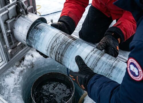
The Little Ice Age was from about 1300 to 1900. Temperatures were generally 1°C cooler than today. Not only is this well-recorded in human history, but it is also recorded in ice cores.
Jorgen Steffensen of the Neils Bohr Institute points out that the Greenland ice cores show that starting around 1650, the temperatures warmed by about 0.7°C and then cooled again by 0.8°C to the point where 1875 became the coldest year on record in 10,000 years (http://vimeo.com/14366077).
The end of this cooling trend from 1850 to 1875 can be seen in Figure SPM 10.
Circa 1850 was also about the same time human emissions of CO2 began to materialize due to the burning of coal. This led to the 1896 Arrhenius theory of CO2-caused global warming.
If one concludes from Figure SPM 10 that the 1850 to 2019 temperature increase was only caused by CO2 emissions, then one should also wonder what temperatures would be now if those emissions never happened.
Would we still be in the Little Ice Age? Adding the ice core data from 1650 to 1850 prompts the further question of what caused the warming trend that started in 1650 during the Little Ice Age.
Knowing the cause of warming is not as important as acknowledging that the climate also changes by non-CO2 and non-human mechanisms. By omitting pre-1850 data from the graph, the IPCC avoids this consideration.
Figure SPM 10 disregards obvious natural climate change by design. It leads the reader to conclude that from 1850 to 2019 all global warming was caused by human CO2 emissions, thus supporting a forecast that global warming will continue linearly from 2020 to 2050.
The graph visually suggests that CO2 emissions alone will cause about 2.0°C warming from 1850 to 2050, while the report itself contradicts that. By ending the graph at 2050 the dramatically diminishing effect of future CO2 emissions on global warming remains hidden.
Figure SPM 10 was designed as a red stoplight for human carbon dioxide emissions and a justification for the abolition of fossil fuels at all costs.
Instead, it should be viewed as a flashing yellow light cautioning us all to read the IPCC Summary for Policymakers carefully. The summary of the Summary is programmed to deceive.
Ron Barmby (www.ronaldbarmby.ca) is a Professional Engineer with a Bachelor’s and Master’s degree, whose 40+ year career in the energy sector has taken him to over 40 countries on five continents. He recently published “Sunlight on Climate Change: A Heretic’s Guide to Global Climate Hysteria” (Amazon, Barnes & Noble) to explain in understandable terms the science of how both natural and human-caused global warming work.


The IPCC is just another Globalists group created by the UN to bring about the real goals of the United Nations and for Global Government all under their control
Misinformation always was the IPCC purpose … https://www.youtube.com/watch?v=XTgEmO6L0Io