 Weather Station at AirportNASA and the National Oceanic and Atmospheric Administration seemed eager in January to declare that 2015 was the hottest year on record. But they left out data that tell a somewhat different story.
When comparing temperatures, it would seem instructive to include a lengthy timeline. That’s not what happened, though, when NASA and NOAA came together to scare the public with their announcement, according to a skeptical website.
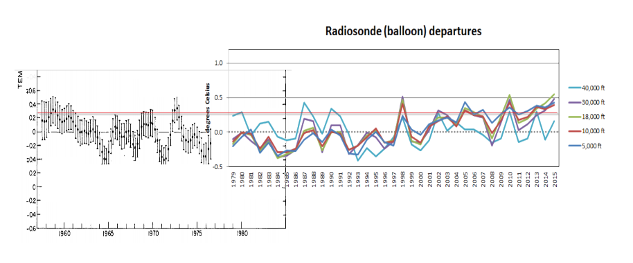
“In their ‘hottest year ever’ press briefing, NOAA included this graph, which stated that they have a 58-year-long radiosonde temperature record. But they only showed the last 37 years in the graph,” says Real Science.
Why would NOAA do such a thing? Because the fuller story contradicts the man-made global warming narrative. The government was “hiding the rest of the data,” says Real Science, which “showed as much pre-1979 cooling as the post-1979 warming.”
Indeed, when temperature data going back to 1957 are attached to the front of the 1979-2015 trend line, a different story materializes. Temperatures fall from the late 1950s to the mid-1960s, then rise and fall throughout the next half century.
So, what does all this indicate?
One, federal agencies have a strong interest in keeping the climate change scare alive. It means more budget and research dollars for them, and it also increases Washington’s power, as the solutions offered to stop global warming are always based on handing more authority to government.
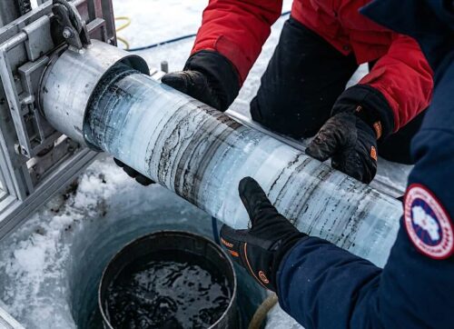
Two, it’s really impossible to say what the real global temperature is year to year, given the many different ways to measure it, the problems created by heat islands and the poor placements of weather stations. And there is also the data tampering by government functionaries and academics who are obsessed with proving something that can never be proved.


