 A new infographic making the rounds today claims to show the temperature history of planet Earth since 1850, this time using an animated spiral presentation (see video after the jump). There’s only one problem: the temperature record they rely on is spotty, doesn’t include vast amounts of sea surface temperatures (because they don’t exist), and disregards uninhabited areas like Antarctica or less developed regions like Africa, South America, Siberia, and rural China (which don’t have reliable historical data).
The new graphic also includes data for the first few months of 2016, which were abnormally warm due to a naturally occurring El Ni√±o. Significantly, the former vice-chairman of the UN’s IPCC recently noted that the strong El Ni√±o was not related to man-made global warming.
{youtube}U1UnX3O172E{/youtube}
The assertions on temperature made in the new historical record conflict with statements by the National Oceanic and Atmospheric Administration (NOAA) that global mean surface temperature change has been close to zero since the turn of the century. A more recent study shows a global warming hiatus since 2000. But the spiraling graphic shows a dramatic increase, with the recent, “massive” El Ni√±o suggesting yet a further upward spiraling.
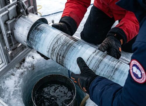
Noticeably absent from much of this data record are accurate ocean temperature records. The Earth’s vast oceans make up 71 percent of the planet’s surface, but have only been measured with any degree of precision since the advent of weather satellites. Prior to actual measurements from ships, buoys, and satellites, scientists have had to rely on ice core samples, marine sediments, fossil records, and other less exacting methods.
In 1967, weather satellites were utilized to determine sea surface temperatures (SSTs), with the first amalgamations appearing in 1970. After 1982, satellites became the de facto method for measuring SSTs and are in basic agreement with more traditional methods. But one problem with these satellite measurements is they only measure the top .01 millimeters or less of the ocean’s surface, which may not be representative of the first upper meter of ocean heat content due to solar interference. Solar problems include surface heating during daytime, reflected radiation, plus heat loss and surface evaporation.
Satellites can measure the oceans across the planet and not just from shipping lanes, where most temperature records were taken in the past. Fresh surface water makes up about one percent, and 2 to 3 percent is locked away in glaciers and ice caps. Most experts agree that SST measurements have had irregularities over their 130-year history primarily due to conflicting methodology. Interestingly, this new graphic extends back to 1850, a 166-year data record.


