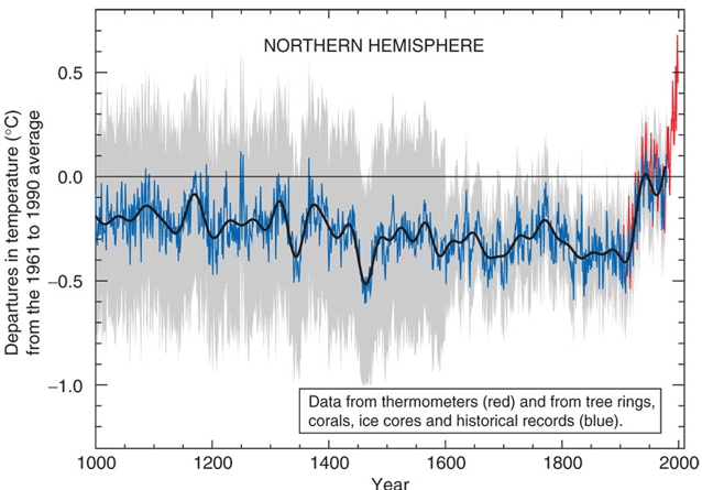
When Michael Mann and the IPCC coordinated efforts to make the Medieval Warm Period disappear from the paleoclimate record in the early 2000s, they employed the visually slick and effective tactic of adding red to the “dangerous” warming trend, and blue to the “safe” cooling trend. The original Mann et al. (1998, 1999) graph that claimed to reconstruct surface temperatures for the entire Northern Hemisphere (by extrapolating from a few select trees located in North America) was published without color. The graph’s red “hockey stick” blade effectively allowed readers to see for themselves just how “dangerous” modern warming really is.
The IPCC has since abandoned Michael Mann’s (Mann et al., 1998, 1999) artwork depicting late-1990s Northern Hemisphere surface temperatures as +0.9¬∞C warmer than they were during Medieval times. (For example, the 2013 IPCC report even acknowledges that many NH regions were as warm or warmer than present during the “Medieval Climate Anomaly”.)
Removing the Mann “hockey stick” graph from the paleoclimate record has come at a cost, though. In many of the graphs of the Middle and Late Holocene constructed since then (with some exceptions), it has become much more difficult to distinguish between warming that is “safe” (for example, warming that will not endanger the lives of polar bears) and warming that is “dangerous” (for example, warming that will endanger the lives of polar bears).
The difficulty distinguishing between “safe” and “dangerous” warming arises because, unlike Mann’s “hockey stick” graph, many recent millennial-scale reconstructions just don’t show enough of a difference between the past climate and the present one to know which is which. In fact, many reconstructions depict the 20th/21st centuries as not any warmer — and in some cases, cooler — than temperatures from a few hundred to a few thousand years ago. This makes the detection of “dangerous” warming even more problematic.
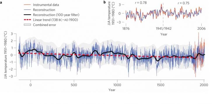
Although it helps to add the color red to aid in deciphering which warming trend is “dangerous” and which is “safe”, sometimes even the additional coloration isn’t enough to tell a difference. For example, consider Esper et al. (2012) . In the main graph from the paper (a), the authors redden the 20th/21st centuries to aid in identifying the warming that is “dangerous” versus that which is blue and thus “safe”. However, the long-term trend is one of cooling, not warming, and the secondary graph (b) even shows that Northern Europe has been cooling overall since the 1940s or so. This can become confusing for the reader concerned about detecting “dangerous” warming.
So . . . as a service to those who may not be able to find the “dangerous” warming in modern scientific publications, below is a helpful guide with easy-to-understand pointing devices (arrows), labeling (“Safe” versus “Dangerous Warming”), and red coloration embedded into the paper’s graphs. The consistently-used bright red hue on the arrow tracking the graph’s “Dangerous Warming” allows readers to locate the “Dangerous Warming” right away — without needing to scan the entire graph. With practice and repetition using these 20+peer-reviewed scientific papers, the average reader will ultimately become adept at distinguishing between the “dangerous” warming that kills polar bears and the “safe” warming that doesn’t kill polar bears.


