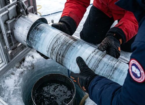
Exhibit A: Al Gore’s Ice Core CO2 Temperature Chart
Ironically, some of the most damning evidence again the AGW or Anthropogenic Global Warming Theory comes from Al Gore himself.
Talking Points:
- Climate change is the norm. Never in the 800,000-year ice-core record is climate not changing.
- Four temperature peaks in the last 400,000 years were all above today’s temperatures and occurred at lower CO2 levels.
- Every glaciation began when CO2 was at or near peak levels, in other words, high CO2 levels were not enough to prevent a glaciation.
- The current record high level of 400 parts per million(ppm) CO2, a full 33% above any previous level on the chart, has failed to carry temperatures to a record high.
- For any cause and effect relationship, the cause MUST lead the effect. CO2 does not lead Temperature, it follows it by 800 to 1,500 years. This video does an exhaustive review of the research. The AGW Theory is similar to claiming that lung cancer causes smoking. (Must Watch Video Clip)
- There is no mechanism defined that explains how or why CO2 would lead temperatures to pull the globe out of an ice age.
- There is no mechanism defined to explain how or why high levels of CO2 would trigger an ice age.
- The only defined mechanism by which CO2 can cause climate change is by trapping outgoing long-wave infrared (LWIR) radiation between the wavelengths of 13 and 18 microns. CO2 can only result in warming, there is no mechanism by which it can result in cooling. CO2 can only trap outgoing radiation, that is it.
- In the documentary “An Inconvenient Truth” Al Gore discusses how his classmate challenged the “consensus” of the continents having never been joined. The teacher mocked Al’s friend for challenging the “consensus.” The arrogant and close-minded teacher spouting the “consensus” view was wrong. Today, Al Gore and his fellow climate alarmists are acting like the closed-minded and very wrong Teacher. Albert Einstein, Christopher Columbus, Michelangelo, and Galileo aren’t remembered for agreeing with the “consensus,” they are remembered for shattering the “consensus.”
- Because the data collected are “proxies” they represent smoothed averages, so the actual true peak temperature or CO2 levels aren’t actually known. Every data point in the Ice Core data represents a time span that can exceed 1,000 years or more. In data lingo, we would say that this data isn’t very “granular,” and doesn’t provide a lot of specific details. It is extremely possible, in fact highly likely that the actual peak temperatures exceeded the level represented in the chart.
- The error bars are not included on the chart so it is impossible to get a true understanding of just how accurate/reliable those numbers are.
- Along with this chart, Al Gore presented many more questionable findings in his documentary “An Inconvenient Truth.”
- No other climate variables are presented on the chart. There may be far more explanatory variables that are excluded, such as the amount of radiation reaching the earth’s surface, cloud cover, cosmic rays, average humidity, particulate matter in the atmosphere, orbit of the earth, tilt of the earth, “wobble” around the axis of the earth, location of the earth is the galactic orbit, etc etc. In other words, Al Gore and the climate alarmists only provide you with enough evidence to reach the conclusion they want you to reach. For instance, I could show you a chart of the government debt and global temperatures and they both fit together pretty well. As the debt increased, so did temperatures, but that chart is pretty meaningless and represents nothing more than a coincidence. In other words, correlation does not prove causation.
- The honesty and integrity of Al Gore and his “friend Lonnie Thompson” are questionable.
- Climate has been extremely variable for the past 800,000, and none of the volatility was due to anthropocentric CO2 prior to 150 years ago. Natural causes clearly dominate the variation in climate, most of which are poorly understood.
- The data in the chart combines proxy ice-core data for the historical record, and instrumental data for near-term up to the current. Those datasets appear to have different volatility characteristics, and is most likely due to the instrumental data being more “granular.” The problem is that this data set isn’t consistent, and is some ways is a combination of apples and oranges. The temperature from the ice core is taken from one location, whereas thermometer data is taken around the globe.
- Here is another chart that shows more information than Al Gore’s. From this chart, one can see the problems with ice-core data. The farther back in time one goes, the dust data seems to dilute, unless for some reason dust concentrations were different during past ice ages. We are also near a record low, which would imply that more visible/warming radiation is reaching the earth. From this chart, it is more logical to conclude that less particulate matter is what is causing the warming than CO2. Maybe that is why Al Gore fails to present the data.
- This chart demonstrates the variability of the Holocene in greater detail.
- This chart highlights how dust, particulate matter, and solar output are extremely important to global temperatures.
Read more at CO2 Is Life


I remember when the 800,000 year comparison of CO2 levels and temperature was first brought up. Since there seems to be a correlation, the alarmists gloated that it was confirmation of the climate change theory. The alarmist got very quiet about this record when it was pointed out that temperature changes lead the changes in CO2 level, not the other way around. Now just as with all of the other data that doesn’t support their theory, this is ignored.